

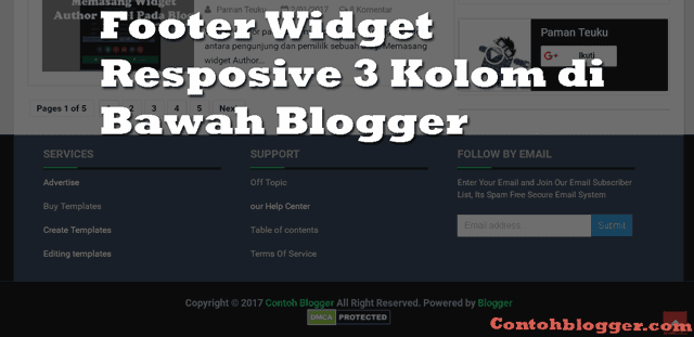
Menambahkan Footer Widget pada blog merupakan cara yang efektif untuk menambah rincian tentang blog kita yang belum kita cantumkan pada navigasi. Dengan adanya Fotter widget ini bisa membuat tampilan blog lebih Profesional seperti kebanyakan website-website pada umumnya.
Keuntungan Menambahkan Footer Widget pada Blog.
Jika kita melihat dari sisi keuntungan ya pasti footer widget ini sangat menguntungkan. Kenapa?, karena jika tidak menguntungkan mengapa footer widget ini dirancang dan banyak dipasang pada website-website profesional. :D
Lanjut ke pokok permasalahan tentang bagaimana cara menambah footer widget respossive ini?. langsung saja disimak tutorial dibawah ini.
Anda perlu menuju ke:
1. Blogger >> Template >> Edit HTML >>
2. Simpan (Copas) kode di bawah ini di atas kode]]>
#footer-widgets {
padding: 20px 0 0 0;
}
.footer-widget-box {
width: 300px;
float: left;
margin-left: 15px;
}
.footer-widget-box-last {
}
#footer-widgets .widget-container {
color: #374142;
}
#footer-widgets h2 {
font-family: inherit;
text-shadow: none;
font-size: 16px;
color: #fff;
text-transform: uppercase;
font-weight: 700;
border-bottom: 4px solid #444444;
padding-bottom: 10px;
}
#footer-widgets .widget ul {
list-style-type: none;
list-style: none;
margin: 0px;
padding: 0px;
}
#footer-widgets .widget ul li {
padding: 0 0 9px 0;
margin: 0 0 8px 0;
}
#footer-widgets-containerback {
width: 980px;
margin: auto;
}
#footer-widgets-container {
background: #484848;
border-top: 10px solid #66b381;
}
.footersec {
color: #A1A6AF;
font-size: 13px;
line-height: 18px;
}
.footersec .widget {
margin-bottom: 20px;
}
#footer-widgets-container { background: #484848; border-top: 10px solid #66b381; float: left; width: 100%; }
.footersec ul {
}
.footersec ul li {
}
3. Copy+Paste kode di bawah ini di atas kode </body>
<div id='footer-widgets-container'>
<div id='footer-widgets-containerback'>
<div class='clearfix' id='footer-widgets'>
<div class='footer-widget-box'>
<ul class='widget-container'>
<li>
<b:section class='footersec' id='footersec1' showaddelement='yes'>
<b:widget id='HTML15' locked='false' title='' type='HTML'>
<b:includable id='main'>
<!-- only display title if it's non-empty -->
<b:if cond='data:title != ""'>
<h2 class='title'><data:title/></h2>
</b:if>
<div class='widget-content'>
<data:content/>
</div>
<b:include name='quickedit'/>
</b:includable>
</b:widget>
</b:section>
</li>
</ul>
</div>
<div class='footer-widget-box'>
<ul class='widget-container'>
<li>
<b:section class='footersec' id='footersec2' showaddelement='yes'>
<b:widget id='HTML14' locked='false' title='Gallery' type='HTML'>
<b:includable id='main'>
<!-- only display title if it's non-empty -->
<b:if cond='data:title != ""'>
<h2 class='title'><data:title/></h2>
</b:if>
<div class='widget-content'>
<data:content/>
</div>
<b:include name='quickedit'/>
</b:includable>
</b:widget>
</b:section>
</li>
</ul>
</div>
<div class='footer-widget-box footer-widget-box-last'>
<ul class='widget-container'>
<li>
<b:section class='footersec' id='footersec3' showaddelement='yes'>
<b:widget id='HTML13' locked='false' title='About' type='HTML'>
<b:includable id='main'>
<!-- only display title if it's non-empty -->
<b:if cond='data:title != ""'>
<h2 class='title'><data:title/></h2>
</b:if>
<div class='widget-content'>
<data:content/>
</div>
<b:include name='quickedit'/>
</b:includable>
</b:widget>
</b:section>
</li>
</ul>
</div>
</div>
</div></div>
<div style='clear:both;'/>
4. Kemudian Copy+Paste kode dibawah ini di setelah kode @media only screen and (max-width:768px) . Jika tidak menemukan kode seperti disamping ini silahkan Anda anda tambahkan dibawah kode HTML diatas..
#footer-widgets-container, #footer-widgets-containerback{margin:0 0 20px 0;width:100%;}Terakhir simpan template dan lihat hasilnya. :)